Gold price plot
Gold is traded on many exchanges all over the world, but the largest ones setting the price of the metal, are three - New York, London and Shanghai. Below is a graph with gold prices from these exchanges. Shanghai(SGE) is trading in physical metal, while New York(Comex) and London(LME) are trading primarily in "paper" gold (ETFs). Daily price difference between Shanghai and New York is displayed on the bottom in red. Also depicted are important events with probable price impact, in blue.
1) made with R
The graph was generated by an R application referencing libraries xts, rvest, dplyr. Data was obtained via web data extraction from kitco.com, SGE and other sources. Gold prices are calculated using USD-to-Yuan exchange rates. Webkit phantomjs was also used to handle some web page Ajax calls.
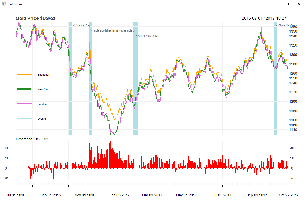
2) made with ECharts
A live interactive chart featuring date range selection, area zoom, auto-resize, tooltips, annotations, show/hide series and image download.
Stock price support
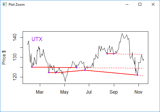
An example of time series data analysis.
Stock closing prices are taken from a PostgreSQL database and local minimums are calculated. If similar values are found, they could represent a price support line.
Extending support lines to the present day could help identify trading opportunities.
The animated picture below shows several Dow stocks (UTX, PG, NKE, JPM, INTC, HD) in 2018 with horizontal price support lines drawn between significant price minimums.
Crypto order fill
The purpose of this project was to show how a cryptocurrency buy order is filled in real-time.
Typically a large buy order is sent to multiple exchanges simultaneously for faster execution.
Responses from those exchanges are monitored in real-time and presented in a dynamic chart.
The graphical part was implemented with library D3.js.
